Both Tracy and Kate trained (many moons ago) as textile designers, Kate studying print and Tracy weave.
They decided to go back to their roots and create a range based around a print technique that every textile student uses at some stage- block printing.
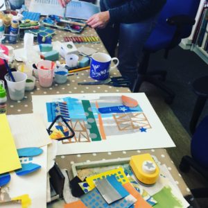
Ideas started to develop during their Friday “studio play” sessions where, along with a few fellow designers, they explore new ideas and use lots of different technique in the hope that inspiration flows and new and brilliant designs evolve!
Still using the Port and lemon blue they decided to (shock horror) add to their palette and include other colours. So a turquoise, orange, yellow and grey were deemed worthy partners.
Blocks were cut from foam into simple geometric shapes, this type of printing works best when you don’t try and get too intricate. inspiration was taken from the popular Scandi style, used in conjunction with their original flat graphic look and interpreted into bright repeat pattern.
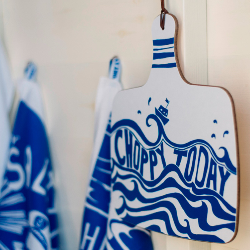
Whilst the quirky strap lines are no longer a must, they have been used in some products such as the tea towels. Other items, like the new cheese boards and mugs, rely on a brash mix of pattern to make them stand out.
The finished range makes a bold and bright statement “no pretty twee pastels here” may have been said once or twice, but then restraint has never been part of the Port and Lemon style…. that would just be dull and they don’t do dull!


